IDB Styleguide
"whitebg" with Styles
Heading 2 with span and with strong
Heading 2 is typically used for product names and section headings. Sometimes it is used as a sentence on a band. Throughout the site it can be seen used as two words with a span or strong such as the Product Features title. Use the "no-pad" class when displaying the an item number immediately below.
Heading 3
Heading 3 is typically used for product names and product feature titles when presented in a long list with paragraphs of supporting information. Use the "no-pad" class when displaying the an item number immediately below.
Heading 4
Heading 4 is typically used as a title for a list. It has also been used as a product title in the reloading section on the Case Prep Center page for example. Use the "no-pad" class when displaying the an item number immediately below.
Heading 5
Heading 5 is typically used as a sub heading. This can be seen in the new products bands. It can also be found as a sub head in the reloading section's secondary and tertiary pages on bands pointing users to respective product pages.
Heading 6
Heading 6 is rarely used.
Paragraph Styles with caption.
Item #1234"default-info" Background with Copy Styles
The default-info band has a gradient at the bottom which really stands out well when placed on top of the woodbg or at the bottom of a page.
Heading 2 with span and with strong
Heading 3
Heading 4
Heading 5
Heading 6
Paragraph Styles with caption.
Item #1234"woodbg" Background with Copy Styles
The woodbg div is used throughout the site as the Video Library background of choice. It is great for seperating highlighted content. It's highly recommended to refrain from using the woodbg more than once on any given page. However, if it is necessary to use the woodbg more than once, make sure there are at least two bands between instances - beware of the zebra stripes.
Heading 2 with span and with strong
Heading 3
Heading 4
Heading 5
Heading 6
Paragraph Styles with caption.
Item #1234"greybg" Background with Copy Styles
The greybg wrapper is used as a band to highlight specific addtional or related content. It also is used as the header for a page that does not use the introtext area. as is the case with this page.
Heading 2 with span and with strong
Heading 3
Heading 4
Heading 5
Heading 6
Paragraph Styles with caption.
Item #1234Using the Block Grid Layout
Block Grid on div containers
The block grid is to be used with the row class when placed on a div container. Shrink the browser to watch the responsive behavior. The largest column layout using this method is a 4-column layout. Change the numbers associated with viewports to adjust layouts as needed.
Block 1
Block 2
Block 3
Block 4
Block Grid on lists
It can also be placed on a ul to be used with list items.
- List Items Goes Here
- List Items Goes Here
- List Items Goes Here
- List Items Goes Here
- List Items Goes Here
- List Items Goes Here
- List Items Goes Here
- List Items Goes Here
- List Items Goes Here
- List Items Goes Here
Image and Text Column Structures
Column structures must be wrapped in a row. The image container always begins with "cutaway-" and followed by "left" or "right". The text container always begins with "text-" and ends with "left" or "right". It is important to keep in mind that the image and text containers can unintentionally overlap if not appropriately labeled.

Cutaway-Left Text-Right
This is the default "cutaway-left" and "text-right" column structure. No addtional column classes or positioning has been applied.
Cutaway-Right Text-Left
This is the default "cutaway-right" and "text-left" column structure. No addtional column classes or positioning has been applied.
Cutaway-Left Col-6 / Text-Right Col-6
This is the "cutaway-left col-6" and "text-right col-6" column structure. The additional "col-6" class has been applied to each container. No additional position has been applied to the image container.
Cutaway-Right Col-6 / Text-Left Col-6
This is the default "cutaway-right col-6" and "text-left col-6" column structure. The additional "col-6" class has been applied to each container. No additional position has been applied to the image container.
Cutaway-Left Col-3 / Text-Right Col-9
This is the "cutaway-left col-3" and "text-right col-9" column structure. The additional "col-6" class has been applied to each container. No additional position has been applied to the image container.
Cutaway-Right Col-3 / Text-Left Col-9
This is the default "cutaway-right col-3" and "text-left col-9" column structure. The additional "col-6" class has been applied to each container. No additional position has been applied to the image container.
Image Positions and Styles Using the Column Structure
The image positions are classes applied to either the cutaway container or the image inside the cutaway container. Make sure to check each viewport when building page content to see how the layout is handling the image and if additional styles/classes need to be applied or removed.
Centered Image Position
This will center the image horizontally in the window. The class is applied to the image container div.
Lorem ipsum dolor sit amet, consectetur adipiscing elit, sed do eiusmod tempor incididunt ut labore et dolore magna aliqua. Ut enim ad minim veniam, quis nostrud exercitation ullamco laboris nisi ut aliquip ex ea commodo consequat.
Off-Canvas Image Position
This will push the image 10% off the side of the content window. It also increases the size of the image The class is applied to the image container div.
Lorem ipsum dolor sit amet, consectetur adipiscing elit, sed do eiusmod tempor incididunt ut labore et dolore magna aliqua. Ut enim ad minim veniam, quis nostrud exercitation ullamco laboris nisi ut aliquip ex ea commodo consequat.
Pad Image Position
This will provide padding between the image and the side of the content window. The class is applied to the image container div.
Lorem ipsum dolor sit amet, consectetur adipiscing elit, sed do eiusmod tempor incididunt ut labore et dolore magna aliqua. Ut enim ad minim veniam, quis nostrud exercitation ullamco laboris nisi ut aliquip ex ea commodo consequat.
Pad Image Position with Border
The "pad" class is applied to the image container div. The border class is applied to the image itself.
Lorem ipsum dolor sit amet, consectetur adipiscing elit, sed do eiusmod tempor incididunt ut labore et dolore magna aliqua. Ut enim ad minim veniam, quis nostrud exercitation ullamco laboris nisi ut aliquip ex ea commodo consequat.

Pad Image Position with Border and Border Radius
The "pad" class is applied to the image container div. The border class is applied to the image itself, as is the border radius inline style. Note the image is squared up in the getMedia resize tag to keep the image from appearing oval.
Lorem ipsum dolor sit amet, consectetur adipiscing elit, sed do eiusmod tempor incididunt ut labore et dolore magna aliqua. Ut enim ad minim veniam, quis nostrud exercitation ullamco laboris nisi ut aliquip ex ea commodo consequat.
Notes about Image Sizes
The width, height and zoom/crop of the image can be manipulated with the getMedia MODX call. However, please keep in mind that for the most part the image size is relative to the size of the container. Sometimes short amounts of text can cause images to appear small, while larger amounts of text can cause the image to behave unexpectedly. Sometimes it really just is a matter of finding the right combination for each indiviual situation as no two products are alike.
Example of Presses Image
To create this, additional padding styles were added to several containers to get the right spacing.
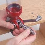
Quick Change Metering Inserts
The Lock-N-Load® powder measure uses quick change metering inserts that allow you to switch from one powder to another with the push of a button. Add one to each die set for the ultimate in quick change overs.
Addtional Image Classes:
- bottom-align | anchors image to bottom of container
- top-align | anchors image to top of container
- cutout | applies a background on mobile
CALIFORNIA RESIDENTS
 WARNING: WARNING: Risk of cancer and reproductive harm from exposure to lead. See www.p65warnings.ca.gov.
Video Library
Rotary Case Tumbler
Clean and polish brass cartridge cases to a brilliant shine with the rotary action of this tumbler, coupled with its steel pin tumbling media (included). Use in conjunction with Hornady® One Shot® Cartridge Case Solution.
Six-liter drum holds 5 pounds of brass cases. Set tumbler to run for up to eight hours in half-hour increments using the digital timer.
110V Item #050220220V Item #050221